library(tidyverse)
library(tidytuesdayR)
library(here)
library(scales)
library(paletteer)22
Lisa’s Vegetable Garden
Overview
Let’s dig in to some plant data for this week’s #tidytuesday.
Set Up
Libraries
Import Data
Here I am actually importing from a saved csv under the hood. Ran into query limits using the direct import from github every time while I was in testing. But I’m showing the original import script with eval:false for this record. I think I’ll stick with this from now on.
tuesdata <- tidytuesdayR::tt_load(2024, week = 22)harvest_2020 <- tuesdata$harvest_2020
harvest_2021 <- tuesdata$harvest_2021
planting_2020 <- tuesdata$planting_2020
planting_2021 <- tuesdata$planting_2021
spending_2020 <- tuesdata$spending_2020
spending_2021 <- tuesdata$spending_2021Theme
Colors
Trying to use earth-tones. I considered creating a table and manually assigning each produce a color that made sense. But I am planning to use labels anyway rather than relying on colors as a legend so I skipped the extra work.
text_color <- "beige"
fill_color <- "#1f2d36"

brown <- "#896C4CFF"
palette <- paletteer::paletteer_d("ggsci::default_jama")
palette_green18 <- paletteer::paletteer_c("ggthemes::Temperature Diverging", n = 18)
palette_green25 <- paletteer::paletteer_c("ggthemes::Temperature Diverging", n = 25)
Script Theme
theme_set(theme_minimal(
  base_family = "Liberation Mono",
  base_size = 12))

theme_update(
  panel.grid.major = element_blank(),
  panel.grid.minor = element_blank(),
  text = element_text(color = text_color),
  axis.text = element_text(color = text_color),
  strip.text = element_text(color = text_color),
  axis.title.x = element_text(margin = margin(10, 0, 0, 0)),
  axis.title.y = element_text(margin = margin(0, 10, 0, 0)),
  plot.title = element_text(hjust = 0),
  plot.title.position = "plot",
  plot.background = element_rect(fill = fill_color, color = NA),
  plot.margin = margin(rep(10, 4)),
  panel.background = element_rect(fill = fill_color, color = NA),
  legend.background = element_rect(fill = fill_color, color = NA),
  legend.key = element_rect(fill = fill_color, color = NA),
  strip.background = element_rect(fill = fill_color, color = NA)
)
EDA
I was initially curious about comparing plot performance. Planting data included which plot the seeds were planted in, but that data was absent from harvesting numbers. So that was out. I turned my attention to yields. We could compare the weight harvested of each plant from 2020 to 2021, but what we really want to know is the yield. For this I want to see the total weight grown from the number of seeds.
This got me thinking about biological efficiency and wondering what plants grow more mass with fewer seeds. I know creating seeds is a cost-benefit balance for the plant. Create many low-value resource-saving seeds, or fewer resource-intensive seeds that each have a higher chance of germination. But we don’t have seed weight data so that will be for another day.
For now though we can look at how many seeds it takes to grow plant mass for each type of produce. Down the line we can use this yield to more accurately compare 2020 vs 2021 accounting for differences in the number of seeds planted.
Yield 2020
h20_weight <- harvest_2020 %>%
  group_by(vegetable) %>%
  summarize(total_weight = sum(weight)) %>%
  ungroup() %>%
  filter(vegetable != "strawberries")

p20_seeds <- planting_2020 %>%
  group_by(vegetable) %>%
  summarize(total_seeds = sum(number_seeds_planted)) %>%
  ungroup() %>%
  filter(vegetable != "strawberries")

yield20 <- p20_seeds %>%
  inner_join(h20_weight, by = "vegetable") %>%
  mutate(yield = total_weight/total_seeds)
Yield 2020 Plot
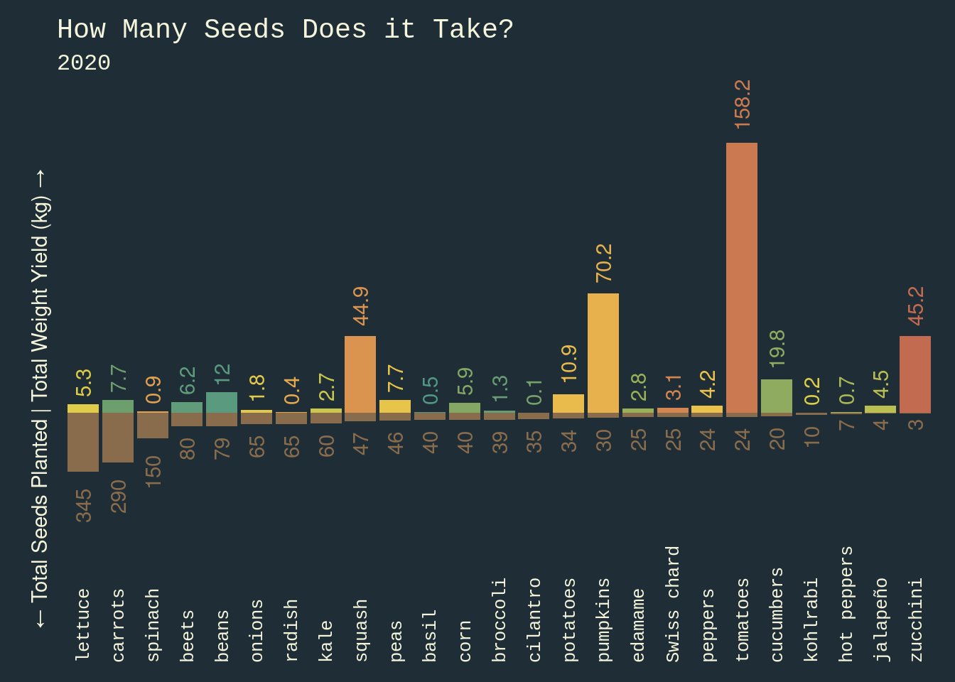
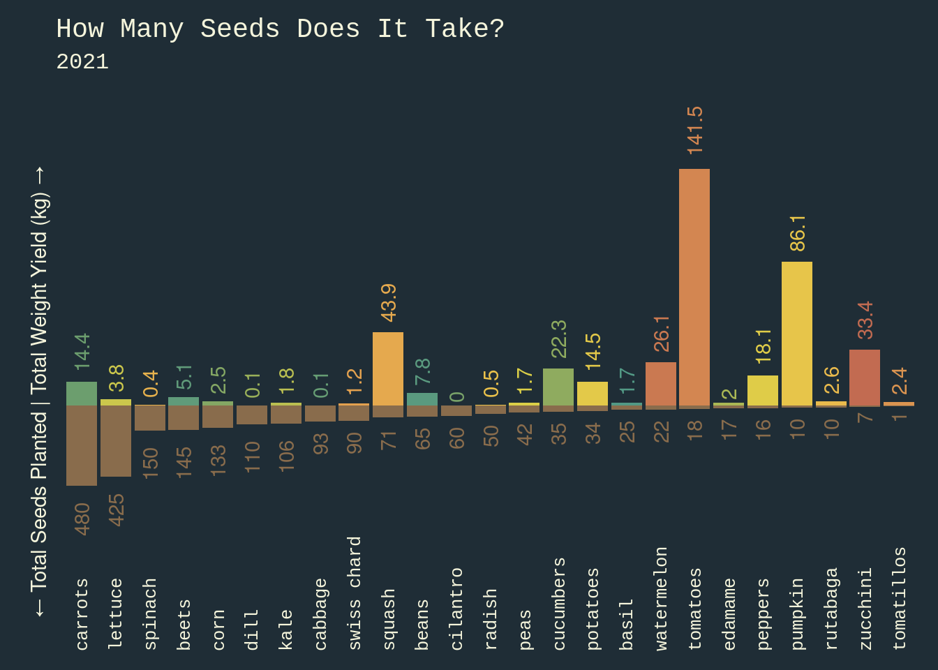
For these plots I wanted to make the seed bars look like they were in the dirt, and the produce mass bars look like they were sprouting out of the dirt. I tried a couple of plot-arrangement libraries like Cowplot and Patchwork, to align two separate plots over a shared x-axis at y = 0. This was a mess. Somewhere in my theme there were margins or padding around the panels that would not go away and I could not for the life of me get two plots to lock together absolutely with no gaps.
So my solution was to just plot two geom_bar plots within a single ggplot argument, invert the seeds plot, and custom scale and label my y-axis. Got the job done.
The remaining issue was scale. The y-axis had to be adjusted by a factor of 10 to allow for the different units (kg and seeds) to coexist in a way that allowed the bars to be visualized. Ultimately this didn’t appear to be a problem as the visual unit comparison does not rely on a direct ratio between each plant’s seed number and weight, but rather a set ratio across all observations, so I was satisfied with adjusting this for aesthetics.
ggplot(data = yield20) +
  geom_bar(
    aes(
      x = reorder(vegetable, -total_seeds),
      y = total_weight,
      fill = vegetable
      ),
    stat = "identity"
    ) +
  geom_bar(
    aes(x = vegetable, y = -total_seeds * 100),
    stat = "identity",
    fill = brown
    ) +
  scale_y_continuous(
    limits = c(-60000, 180000)
    ) +
  geom_text(
    aes(
      x = reorder(vegetable, -total_seeds),
      y = total_weight,
      label = round(total_weight / 1000, 1),
      color = vegetable
      ),
    vjust = .5,
    hjust = -.25,
    angle = 90
    ) +
  geom_text(
    aes(
      x = reorder(vegetable, -total_seeds),
      y = -total_seeds * 100,
      label = round(total_seeds, 1)
      ),
    color = brown,
    vjust = .5,
    hjust = 1.5,
    angle = 90
    ) +
  coord_cartesian(clip = "off") +
  labs(
    title = "How Many Seeds Does it Take?",
    subtitle = "2020"
    ) +
  annotate(
    "text",
    x = -Inf,
    y = 0,
    label = "← Total Seeds Planted | Total Weight Yield (kg) →",
    color = "beige",
    angle = 90,
    hjust = .47,
    vjust = -1
    ) +
  theme(
    axis.text.x = element_text(angle = 90, hjust = 0, vjust = 0.5),
    axis.text.y = element_blank(),
    axis.title.x = element_blank(),
    axis.title.y = element_blank(),
    plot.margin = margin(10, 10, 10, 30),
    legend.position="none"
  ) +
  scale_fill_manual(values = palette_green25) +
  scale_color_manual(values = palette_green25)
Yield 2021
h21_weight <- harvest_2021 %>%
  group_by(vegetable) %>%
  summarize(total_weight = sum(weight)) %>%
  ungroup() %>%
  filter(vegetable != "strawberries")

p21_seeds <- planting_2021 %>%
  group_by(vegetable) %>%
  summarize(total_seeds = sum(number_seeds_planted)) %>%
  ungroup() %>%
  filter(vegetable != "strawberries")

yield21 <- p21_seeds %>%
  inner_join(h21_weight, by = "vegetable") %>%
  mutate(yield = total_weight/total_seeds)
Yield 2021 Plot
ggplot(data = yield21) +
  geom_bar(
    aes(
      x = reorder(vegetable, -total_seeds),
      y = total_weight,
      fill = vegetable
    ),
    stat = "identity"
  ) +
  geom_bar(
    aes(x = vegetable, y = -total_seeds * 100),
    stat = "identity",
    fill = brown
  ) +
  scale_y_continuous(
    limits = c(-60000, 180000)
  ) +
  geom_text(
    aes(
      x = reorder(vegetable, -total_seeds),
      y = total_weight,
      label = round(total_weight / 1000, 1),
      color = vegetable
    ),
    vjust = .5,
    hjust = -.25,
    angle = 90
  ) +
  geom_text(
    aes(
      x = reorder(vegetable, -total_seeds),
      y = -total_seeds * 100,
      label = round(total_seeds, 1)
    ),
    color = brown,
    vjust = .5,
    hjust = 1.5,
    angle = 90
  ) +
  coord_cartesian(clip = "off") +
  labs(
    title = "How Many Seeds Does It Take?",
    subtitle = "2021"
  ) +
  annotate(
    "text",
    x = -Inf,
    y = 0,
    label = "← Total Seeds Planted | Total Weight Yield (kg) →",
    color = "beige",
    angle = 90,
    hjust = .47,
    vjust = -1
    ) +
  theme(
    axis.text.x = element_text(angle = 90, hjust = 0, vjust = 0.5),
    axis.text.y = element_blank(),
    axis.title.x = element_blank(),
    axis.title.y = element_blank(),
    plot.margin = margin(10, 10, 10, 30),
    legend.position="none"
  ) +
  scale_fill_manual(values = palette_green25) +
  scale_color_manual(values = palette_green25)
Results
I considered normalizing the data here to a set weight and plotting a single bar chart, but the fun was in seeing seed numbers AND harvest weight numbers as stacked bars. So I left it as is.
What we see is a spectrum of plant adaptation. It is not surprising that the plants that grow more mass from fewer seeds have the heavier fruit. For these plants, the fruiting bodies are the currency by which the plants make a deal with their animal seed distributors. These heavy fruits come as a food offering and as such their seeds must survive animal digestive tracts. Compare this with the other end of the spectrum where you see less investment into fruiting bodies. These plants may typically produce more, smaller, less resource-intensive seeds and rely instead on things like wind or gravity for propagation.
This is a very broad generalization, but it seems to fit with our trends.
Yields Change
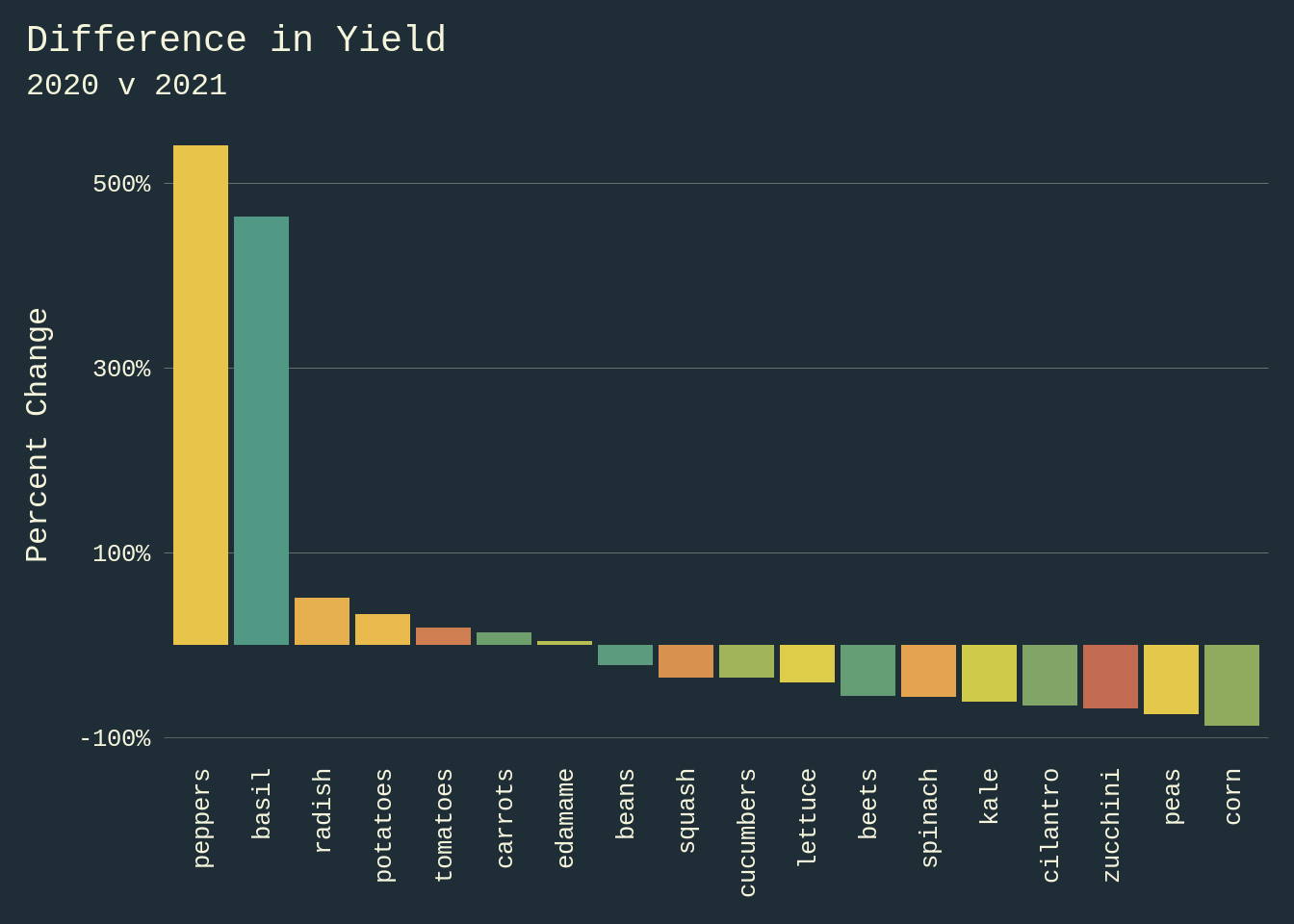
Now we can compare 2020 and 2021 harvest yields with more accuracy than simply comparing the sum of each plants weight. Let’s consider the difference in yield as a percent change in yield from 2020 to 2021.
yields <- inner_join(
  yield20,
  yield21,
  by = "vegetable",
  suffix = c(".20", ".21")
  ) %>%
  group_by(vegetable) %>%
  ungroup() %>%
  mutate(
    change_yield = (yield.21 - yield.20) / yield.20
  )
Yield Change Plot
ggplot(
  data = yields,
  aes(
    x = reorder(vegetable, -change_yield),
    y = change_yield,
    fill = vegetable,
    )
  ) +
  geom_bar(stat = "identity") +
  scale_y_continuous(
    labels = scales::percent,
    breaks = seq(-1, 5, by = 2)
    ) +
  labs(
    title = "Difference in Yield",
    subtitle = "2020 v 2021",
    y = "Percent Change"
    ) +
  theme(
    panel.grid.major.y = element_line(color = text_color, linewidth = 0.05),
    legend.position = "none",
    axis.text.x = element_text(
      angle = 90,
      hjust = 1,
      vjust = .5),
    axis.title.x = element_blank()
    ) +
  scale_fill_manual(values = palette_green18)
Analysis
2021 was a down year from 2020 for much of the garden based on yield from seeds, but Peppers and Basil were loving life. Hope you are too.